Contribution component

Use a Contribution chart component if you want to compare single calculated values in either a pie or column chart or in a table. The Contribution component compares values that are portions of a whole.
Contribution pie chart
A pie chart is a circular chart divided into sectors where the area of each sector is proportional to its percentage of the whole. You can emphasize one or more sections of the pie by clicking them, offsetting them from the main figure. You can also order based on their relative value in a counter-clockwise fashion, starting from the three o'clock position.
Note that you should only use pie charts when you are sure that the series names will not crowd each other and when none of the values are negative.
You can display dates and show the percentage of each data series.
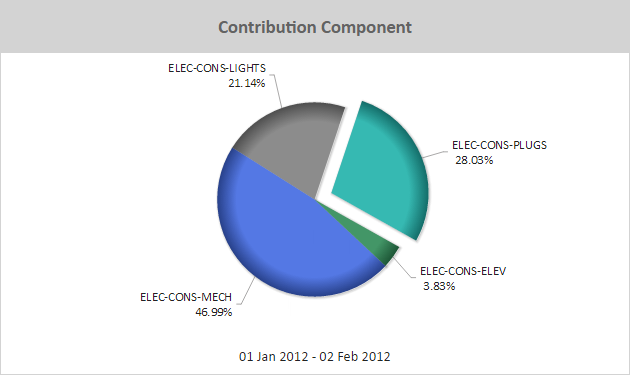
Figure: Contribution Component pie chart example
When viewing a Contribution pie chart online, you can:
- Rotate a pie chart so that prominent sections appear at the top of the chart, for example. To rotate a pie chart, click the chart and drag it in a circular motion.
- Click a slice of the pie chart to emphasize it. This separates the slice slightly from the pie.
- Hover over a pie slice to view a flyout that contains the contribution value for that slice.
Note: Use a pie chart to show a year-to-date energy usage breakdown.
Use the following steps to create a Contribution pie chart:
- Add a Contribution component to a report and click the component's Edit
 icon in the component's banner.
 - Click Edit in the menu.
- On the Edit tab of the Edit Contribution Component page, select Chart.
- Click Pie.
- Click Add Report Data and add one or more data series to graph.
- Select ordering for the pie chart pieces: No Sort, Low-High, High-Low. Sorting places the pieces in order by value, in a counter-clockwise progression, starting at the three o'clock position.
- Click Show percentages to display percentage callouts in the pie chart.
Contribution column chart
Instead of a pie chart, the Contribution component can be displayed as a column chart. You can sort the columns so they are presented in order, with the smallest value on the left and the largest value on the right (Low-High). You can also reverse this order (High-Low) or not use ordering at all.
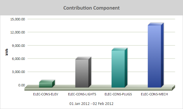
Figure: Contribution Component column chart example
When viewing a Contribution column chart online, you can hover over a column to view a flyout that contains the contribution value for that column.
Use the following steps to create a Contribution column chart:
- Add a Contribution component to a report and click the component's Edit icon in the component's banner.
- Click Edit in the menu.
- On the Edit tab of the Edit Contribution Component page, select Chart.
- Select Column.
- Select ordering for the columns: No Sort, Low-High, High-Low.
- Click Add Report Data and add one or more data series to graph.
- Click Display dates to show the date range of the data used in the chart. This will show the data range below the chart.
© 2019 Reliable Controls Corporation. All rights reserved. Published October 29, 2019