Correlation component
Use a Correlation chart component if you want to identify how one data point influences others. A scatter chart is most commonly used to render data in this component. The Correlation component plots multiple data points on the y-axis against a selected x-axis point.
The data series to be used for the x-axis is represented by the first row in the grid and can be easily changed by selecting a series name in the X-Axis drop-down list, as shown below:
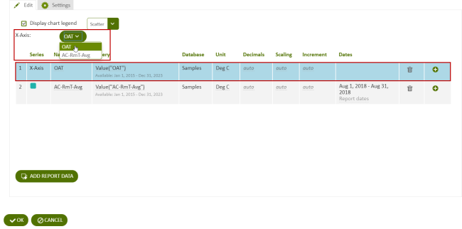
Figure: Define the x-axis for the Correlation Component on the first line of the data grid
Correlation scatter chart
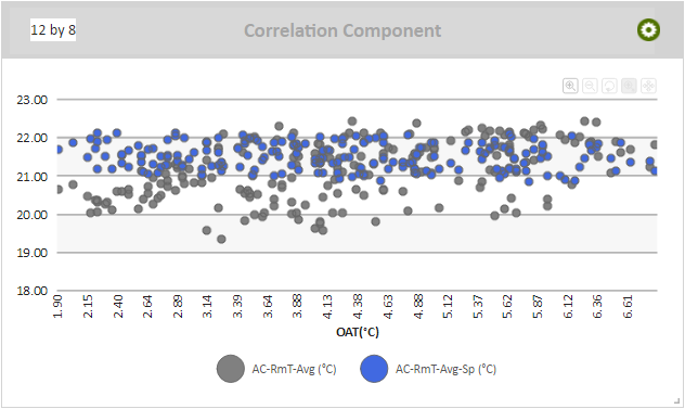
Figure: Correlation Component scatter chart
When viewing a Correlation scatter chart online, you can:
- Click a data series name in the legend to view or hide the related scatter points in the chart, if a legend is included.
- Hover over a scatter point to view a flyout that contains the value for that scatter point, and the time that the two data series had a point at that value.
Note: Use a Correlation scatter chart to determine the relationship between average daily DAA cooling cycles and the outdoor air temperature.
Use the following steps to create a Correlation scatter chart:
- Add a Correlation component to a report and click the component's Edit
 icon in the component's banner.
 - Click Edit in the menu.
- Select Scatter
- Click Add Report Data and add at least two data series.
- Select an X-Axis.
- Click Display chart legend to display a legend.
Correlation line chart
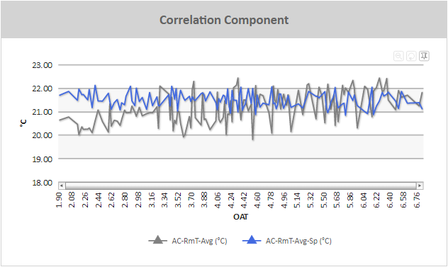
Figure: Correlation Component line chart example
When viewing a Correlation line chart online, you can:
- Zoom into particular areas of the chart by clicking and dragging a selecting area in the line chart. The chart will zoom into the area you have selected.
- Scroll right and left through a zoomed area using the horizontal scroll bar at the bottom of the graph.
- Hover over points in a line chart to view a flyout that contains the y-axis value
- If a legend is included, click a data series name in the legend to view or hide the related line in the chart.
- Click the Switch to Pin Mode
 icon to select a section of the graph and drag it to another part of the graph in order to overlay the two line sections. This makes it easier to directly compare two sections of a line graph.
 - Zoom out one level by clicking the Zoom out one level
 icon.
icon. - Reset the zoom of the chart by clicking Reset Chart
 icon.
icon.
Use the following steps to create a Correlation line chart:
- Add a Correlation component to a report and click the component's Edit icon in the component's banner.
- Click Edit in the menu.
- Select Column-Line.
- Click Add Report Data and add at least two data series.
- Select an X-Axis.
- For each data series except for the data series assigned as the x-axis, click in the Series column and click Line.
- Click Display chart legend to display a legend.
Correlation column chart
When viewing a Correlation column chart online, you can:
- Hover over a scatter point to view a flyout that contains the value for that scatter point.
- If a legend is included, click a data series name in the legend to view or hide the related scatter points in the chart.
Use the following steps to create a Correlation Column chart:
- Add a Correlation component to a report and click the component's Edit icon in the component's banner.
- Click Edit in the menu.
- Select Column-Line.
- Click Add Report Data and add at least two data series.
- Select an X-Axis.
- For each data series except for the data series assigned as the x-axis, click in the Series column and click Column.
- Click Display chart legend to display a legend.
© 2019 Reliable Controls Corporation. All rights reserved. Published October 29, 2019