Date Range component

Use Date Range chart component if you want to see data plotted against time with full flexibility of the sample period. The Date Range component displays values at custom intervals over the course of a single date range.
You can use the Date Range component to present data in a:
- Column chart
- Column-Line chart
- Dashed Line
- Line chart
- Stacked column chart
- Table
- Combination of either a line, column, or stacked column chart, with a table underneath.
You can plot multiple data series on the same Date Range chart. For example, you can show a column chart and a line chart on the same axis. You can also include a table to represent the same data in a tabular format at the interval of time selected.
The Date Range component includes a sampling control. Use report sampling to show aggregate values, for example, average daily temperature or total weekly energy consumption. You can also use sampling to display data at specific times, for example, the temperature of X at regular 2-hour intervals, or the building occupancy at 7 a.m. every day.
You can sample:
- At intervals of a specified number of minutes, for example every 15 minutes.
- At intervals of a specified number of hours, for example every 3 hours.
- On a particular day at a particular time.
- Weekly, on particular days, at particular times.
- Monthly, on particular days, at particular times.
- Yearly, on particular days, at particular times.
Date Range line chart
Use a line chart to explore specific events.
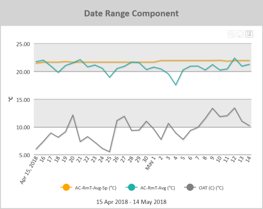
Figure: Date Range line chart example
When viewing a Date Range line chart online, you can:
- Zoom into particular areas of the chart by clicking and dragging a selecting area in the line chart. The chart will zoom into the area you have selected.
- Scroll right and left through a zoomed area using the horizontal scroll bar at the bottom of the graph.
- Hover over points in a line chart to view a flyout that contains the y-axis value
- If a legend is included, click a data series name in the legend to view or hide the related line in the chart.
- Click the Switch to Pin Mode
 icon to select a section of the graph and drag it to another part of the graph in order to overlay the two line sections. This makes it easier to directly compare two sections of a line graph.
 - Zoom out one level by clicking the Zoom out one level
 icon.
icon. - Reset the zoom of the chart by clicking Reset Chart
 icon.
icon.
See Interactive elements in reports for more information about manipulating the presentation of the data in a report.
Note: Use a Date Range line chart to show how the “optimized start” of an HVAC system is bringing the air temperature close to setpoint just before a building becomes occupied. You can zoom in to specific events where the HVAC has started too soon, or not soon enough, and add extra trends to investigate the root cause.
Note: Use a Date Range line chart to investigate why a building is using too much energy outside of occupancy hours. Trending all energy points using a Date Range line chart can help identify which areas are using the most energy outside of occupancy. Adding actual occupancy as a data series helps quickly identify the times of interest.
Note: Use a Date Range line chart to track instantaneous electrical demand of a piece of equipment to help identify maintenance requirements. If a unit is drawing more power than expected, it might require repair.
Use the following steps to create a Date Range line chart:
- Add a Date Range component to a report and click the component's Edit
 icon in the component's banner.
 - Click Edit in the menu.
- On the Edit tab of the Edit Date Range Component page, select Chart.
- Click Add Report Data and add one or more data series to graph. For more information on adding data series, see Report Data and Edit Component dialog boxes.
- For each data series, click in the Series column and click Line.
- Click Display chart legend to display a legend.
- Click Display dates to show the date range of the data used in the chart. This will show the data range below the chart.
Date Range column chart
Use a column chart to show aggregated groups of data.
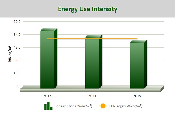
Figure: Date Range column chart example
When viewing a Date Range column chart online, you can:
- Hover over columns to view a flyout that contains the column value.
- If a legend is included, click a data series name in the legend to view or hide the related column in the chart.
Note: Use a Date Range column chart to track total daily energy usage outside of occupancy hours over the last week/month. This provides a quick visual indicator that things are performing acceptably when the building is not occupied.
Note: Use a Date Range column chart and the 'delta' query function to display monthly domestic water consumption to quickly ascertain if waste is occurring.
Note: Use a Date Range column chart to help identify power spikes by showing hourly maximum electrical demand.
Use the following steps to create a Date Range column chart:
- Add a Date Range component to a report and click the component's Edit icon in the component's banner.
- Click Edit in the menu.
- On the Edit tab of the Edit Date Range Component page, select Chart.
- Click Add Report Data and add one or more data series to graph. For more information on adding data series, see Report Data and Edit Component dialog boxes.
- For each data series, click in the Series column and click Column.
- Click Display chart legend to display a legend.
- Click Display dates to show the date range of the data used in the chart. This will show the data range below the chart.
Date Range stacked column chart
Stacked charts help to display the cumulative magnitude of two or more data series. They help in representing a data value as a sum of two or more values. Each data series can be distinguished by the color of its section in the stack.
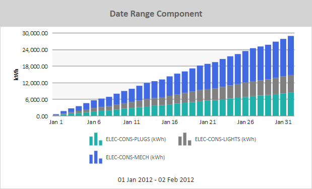
Figure: Date Range stacked column chart example
When viewing a Date Range stacked column chart online, you can:
- Hover over a column to view a flyout that contains the column value.
- If a legend is included, click a data series name in the legend to view or hide the related column in the chart.
Note: Use a Date Range stacked column chart to show a breakdown of energy usage per period. Each column is composed of multiple stacks, with each stack representing a different energy usage (e.g. lights, plugs, etc.). Adding a column stack with the total energy consumption as measured by another meter could give a quick verification that the totals are correct.
Use the following steps to create a Date Range stacked column chart:
- Add a Date Range component to a report and click the component's Edit icon in the component's banner.
- Click Edit in the menu.
- On the Edit tab of the Edit Date Range Component page, select Chart.
- Click Add Report Data and add one or more data series to graph. For more information on adding data series, see Report Data and Edit Component dialog boxes.
- For each data series, click in the Series column and click Stack.
- For each data series, define the stack in which the data series will appear. For example, for three data series to appear stacked in the same column, define them all as belonging to the same stack number.
- Click Display chart legend to display a legend.
- Click Display dates to show the date range of the data used in the chart. This will show the data range below the chart.
© 2019 Reliable Controls Corporation. All rights reserved. Published October 29, 2019