Profile component

Use the Profile chart component to show the characteristic curve of a point or function, and to identify anomalies for a given day, week, month, or year. You can also use the Profile component to compare a year, month, week, or day with another time period or reference value.
You can use the Profile component to present data in a:
- Column chart
- Column-Line chart
- Dashed Line
- Line chart
- Stacked column chart
- Table
Profile components are configured to sample data based on the selected time interval, set in the Profile Type box. When Profile Type is set to Daily, the x-axis will use a 24-hour period sampled every hour. When Profile Type is set to Weekly, the x-axis will use a 7-day period sampled every day of the week (Mon-Sun). When the Profile Type is set to Monthly, the x-axis will use a one month period sampled every day of the month (1-31). Yearly is also an option, providing an output for each month of the year.
Profile line chart
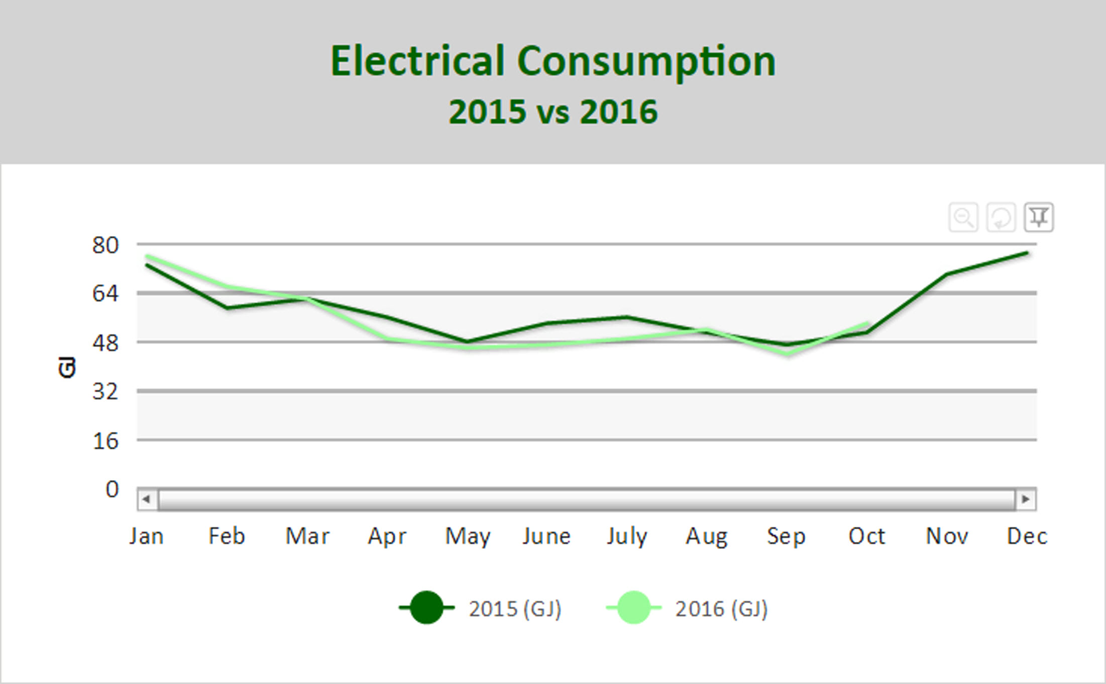
Figure: Profile Component line chart example
When viewing a Profile line chart online, you can:
- Zoom into particular areas of the chart by clicking and dragging a selecting area in the line chart. The chart will zoom into the area you have selected.
- Scroll right and left through a zoomed area using the horizontal scroll bar at the bottom of the graph.
- Hover over points in a line chart to view a flyout that contains the y-axis value
- If a legend is included, click a data series name in the legend to view or hide the related line in the chart.
- Click the Switch to Pin Mode
 icon to select a section of the graph and drag it to another part of the graph in order to overlay the two line sections. This makes it easier to directly compare two sections of a line graph.
 - Zoom out one level by clicking the Zoom out one level
 icon.
icon. - Reset the zoom of the chart by clicking Reset Chart
 icon.
icon.
Use the following steps to create a Profile line chart:
- Add a Profile component to a report and click the component's Edit
 icon in the component's banner.
 - Click Edit in the menu.
- On the Edit tab of the Edit Profile Component page, select Chart.
- In the Profile type: box, select one of: Daily, Weekly, Monthly or Yearly.
- Click Add Report Data and add one or more data series to the component data grid.
- For each data series, in the Series column, select Line.
- Click Display chart legend to display a legend.
- Click OK.
Profile column chart
Use a Profile column chart to analyze the average trend over a period of time. The following image shows the monthly average electrical demand and the monthly average outside air temperature.
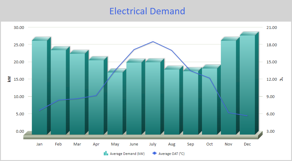
Figure: Profile Component column chart example
When viewing a Profile column chart online, you can:
- Hover over columns to view a flyout that contains the column value.
- If a legend is included, click a data series name in the legend to view or hide the related column in the chart.
Use the following steps to create a Profile Column chart:
- Add a Profile component to a report and click the component's Edit icon in the component's banner.
- Click Edit in the menu.
- On the Edit tab of the Edit Profile Component page, select Chart.
- In the Profile type: box, select one of: Daily, Weekly, Monthly or Yearly.
- Click Add Report Data and add one or more data series to the component data grid.
- For each data series, in the Series column, select Column.
- Click Display chart legend to display a legend.
- Click OK.
Profile stacked column chart
A Profile stacked column chart is similar to column charts with the added advantage of being able to break down totals for each period.
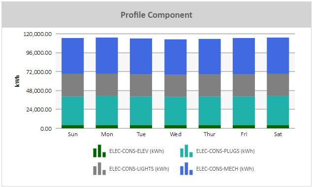
Figure: Profile Component stacked column chart example
Note: Use a Profile stacked column chart to show year-over-year energy usage broken down by usage type.
Use the following steps to create a Profile stacked column chart:
- Add a Profile component to a report and click the component's Edit icon in the component's banner.
- Click Edit in the menu.
- On the Edit tab of the Edit Profile Component page, select Chart.
- In the Profile type: box, select one of: Daily, Weekly, Monthly or Yearly.
- Click Add Report Data and add one or more data series to graph.
- For each data series, click in the Series column and click Stack.
- For each data series, define the stack in which the data series will appear. For example, for three data series to appear stacked in the same bar, define them all as belonging to the same stack number.
- Click Display chart legend to display a legend.
- Click OK.
© 2019 Reliable Controls Corporation. All rights reserved. Published October 29, 2019